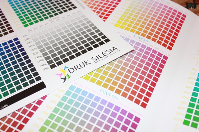
When thinking about branding and in particular colourways and logos etc, you need to think about how it is going to look on different types of print work. Some people design their logo on a black background to discover it doesn’t look right on white or vice versa.
Try out your logo in a number of colours and make sure that any text is still clearly readable when shrunken down to business card size.
You can, of course, change your logo slightly for use on the web, signage and print but it is probably not ideal especially if you are just starting out trying to build up your brand and brand recognition.
Always get your logo designed by someone that knows what they are doing. They should be able to give you the logo in a number of different formats such as .eps, .jpeg etc as you may all of them depending on what it is you are printing. If you try to enlarge a jpeg image it will most likely pixelate and this does not look good. Vector images can be altered in size without causing an issue with the quality of the overall finish.